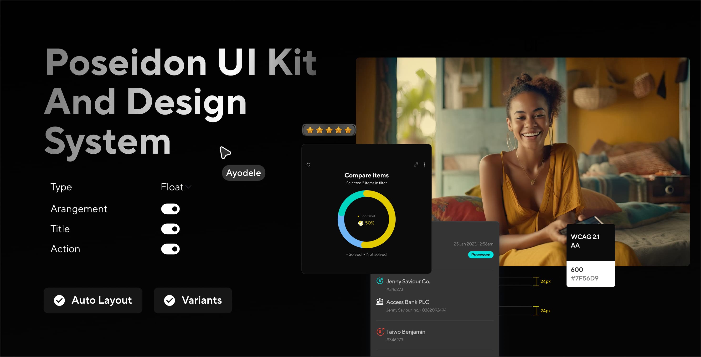
01
The story
Hydrogen was getting bigger.
More products were being added. More designers were working on different parts of the platform. More engineers were building new features. That growth was good.
But I started noticing something.
The same things were being designed in different ways. A button on one screen did not always look or behave like a button on another. Forms used different spacing. Tables had different layouts. Some components had loading and error states. Others did not.
At first these looked like small visual differences. But when you put enough of them together, the bigger problem became clear.
Hydrogen was starting to feel like several products instead of one. And the bigger it became, the harder that would be to fix.
That was where Poseidon came in.
02
The problem
We had several versions of most things.
We already had components. The problem was that we had different versions of the same ideas.
Five product teams were building different parts of Hydrogen. Each team was moving quickly and solving the problems in front of them. So when someone needed a button, they made a button. When someone needed a form, they made a form. Then another team did the same thing.
Over time, small differences started to appear.
- Different heights
- Different spacing
- Different colours
- Different states
- Different behaviours
None of these decisions were necessarily wrong. They simply were not connected.
Asking people to be more careful was never going to work.
So the question became: how do we create one shared way of building Hydrogen that different teams can actually use?
03
Looking backwards first
Before creating a new design system, I wanted to understand what we already had.
I went through existing Hydrogen screens and collected the UI we were using, then grouped similar things together. Buttons. Inputs. Tables. Dropdowns. Modals. Navigation. Statuses. Forms.
The more I looked, the clearer the pattern became. We had solved many of the same problems several times, and sometimes we had solved the same problem differently.
That audit gave us something important. A starting point. Instead of saying everything needs to change, we could see exactly where the system was breaking down.
04
Foundations
We agreed the rules before anyone drew a button.
I did not want Poseidon to become a giant collection of components that looked nice in Figma but did not really solve the problem. So we started with the rules everything else would be built on.
Colour
Instead of choosing colours separately for every screen, designers could use shared values for primary actions, success, warning, error, information, backgrounds, borders and text.
But there was an important decision here. We used semantic tokens.
Blue 500
Describes what a colour looks like. The day the brand changes, or somebody adds a dark mode, the name is a promise the colour can no longer keep.
Action Primary
Describes why we are using it. The system can change without forcing designers to rethink every screen.
This is also why it had to be semantic rather than literal. The same brand has to work on its own yellow and inverted on black, and a token called Blue 500 cannot do both.
Typography
We defined the type styles used across Hydrogen. Page titles. Section headings. Body text. Labels. Supporting text. Table text.
The goal was simple. A designer should not have to decide from scratch what size, weight or line height a piece of text should use. The system should already answer that.
Spacing
Spacing was another place where small differences had started to add up. One screen might use 16px. Another 20px. Another 24px for a similar relationship.
We created a shared spacing scale, so the gap between a label and its field meant the same thing on every screen.
Icons and the rest
We created shared rules for icons and the other basic visual properties. These foundations became the layer underneath everything else.
05
Components
Now we could build.
I contributed roughly 20 to 40 components to Poseidon. But I did not want to think of a component as just a visual object. A button is not finished because the default state looks good.
So each component had to answer questions like:
- What happens when it is disabled?
- What happens when something is loading?
- What happens when there is an error?
- What happens when the content is longer than expected?
- What happens on different screen sizes?
Buttons
We defined the main types, sizes and states: primary, secondary and destructive actions, disabled, loading, and the sizes around them. Instead of every designer creating their own version, they could choose from a shared set.
After that, starting a new feature meant picking the right existing button rather than drawing another one.
Inputs
Hydrogen has many workflows that depend on users entering information correctly, so form behaviour mattered as much as appearance. We built reusable inputs for text, numbers, currency, search, select, date and error states.
We also made the states part of the component. An input was not just empty to filled. It was empty, focused, filled, error, disabled. That gave designers and engineers a shared answer for what each state should look and behave like.
Tables
Tables mattered because Hydrogen handles a lot of business information, and different teams had been solving them in slightly different ways. We wrote shared rules for row height, column spacing, statuses, actions, sorting, filtering, empty states, loading states and pagination.
Test use case
What we were after was familiarity. If somebody had used one Hydrogen table, they should not have to learn a new one on the next screen.
The parts, in use. This is what the audit turned into.
06
From components to patterns
Then we moved up a level, to whole flows.
A payment flow is made of many decisions working together. Select beneficiary, enter amount, review, confirm, success.
The components gave us the building blocks. The patterns gave us a way to put those blocks together, and the same thinking applied across Hydrogen:
Onboarding
Collect information, upload documents, review, submit.
Transactions
Search, filter, view the transaction, take action.
Approvals
Review the request, check the details, approve or reject, confirmation.
This changed the starting point. Instead of opening a blank Figma page and asking how should I design this, a designer could start with: what existing pattern solves most of this problem?
07
Getting it used
Getting people to use it was the real work.
It is easy to build a beautiful design system. It is much harder to get multiple teams to actually use it. Poseidon involved 4 designers and 5 product teams, so adoption could not depend on one person telling everyone what to do.
We had to make the system useful enough that teams wanted to use it. That meant finding the right component quickly, clear names, reusable patterns, clear states, working closely with engineers, and components that solved real product problems. The system had to fit the way teams already worked.
Naming became surprisingly important
Even when the right component existed, finding it was not always obvious. So we named things for what they are rather than what they look like.
Instead of
We could say
Blue Button
Button / Primary / Medium
Red Input
Input / Currency / Error
This sounds small. But when a system contains dozens of components, good naming saves a lot of time. A designer should be able to look at a component and understand what it is without opening it first.
Engineering was in it from the start
I worked closely with engineers to make sure the components we designed could actually work in the product. We talked through what happens when text gets longer, when an error appears, while something is loading, which parts should be reusable, which states need to exist in code, and whether the same component should behave the same way everywhere.
A component was only done when the design, the behaviour and the code all agreed with each other.
So the Figma library was only half of the job. Every part in it was built as a real code component too, and both were published together. A designer picking a button in Figma and an engineer importing one from the library were reaching for the same thing, with the same names, the same variants and the same states.
That is what the docs page was for. Each component had its design, the props an engineer needs and the code to paste in, all on one page, so nobody had to guess how the drawing turned into the build.
08
Keeping it from breaking again
Six months in, the old habits started coming back.
A team needs something. They create a one-off solution. Someone else copies it. Another team changes it. Six months later you have three versions of the same thing again.
So we created a simple way of thinking about new UI.
- Check Poseidon first. Does something already exist?
- Reuse it. If it works, use it.
- Improve it. If it almost works, improve the shared component instead of creating another version.
- Create something new only when the problem is genuinely new.
- Work with engineering, so the solution can be built and reused.
- Add it back to Poseidon, so the next team does not solve the same problem again.
This helped Poseidon become a living system instead of a one-time Figma project.
The ladder, in public. A part cannot claim a rung it has not earned.
09
Six months later
Four of the five products had moved across.
Within six months, 4 of the 5 products had migrated to Poseidon.
35% faster design handoff.
Designers and engineers had clearer shared components and states to work from.
60% fewer visual bugs.
Fewer inconsistencies between what was designed and what was built.
Internal score up from 62 to 78.
The survey score for the system improved as teams adopted it and became familiar with it.
The products afterwards, finally looking related.
These numbers mattered because they showed Poseidon was doing more than making Figma files cleaner. It was changing how the teams built Hydrogen.
10
What I learned
When I started, I thought the main job was to build a design system.
By the end I saw the job differently. The components were only one part of it. The harder part was getting different people to agree on the same rules.
Four designers. Five product teams. Different products, different priorities, different ways of working. Poseidon gave everyone a shared starting point, and that was the real value.
Poseidon turned out to be a way of making decisions together, more than a library of screens.
Before
How should we build this?
After
How does Hydrogen already solve this?
That shift made the product easier to design, easier to build, and easier to keep consistent as it grew.